In the world of hospitality, every detail matters—and colour is one of the most powerful design tools available. From first impressions to lingering emotions, the colours used in a restaurant’s interior shape how customers feel, how long they stay, and even how much they spend.
At BE Furniture Sales, we know that well-chosen colour palettes and furniture aren’t just about style. They’re about creating a space that supports your brand, sets the tone for your service, and delivers a memorable experience for your guests.
Colour is Key to Restaurant Branding
A restaurant’s colour palette is often the first thing a customer notices before entering the door. It reinforces brand recognition, sets expectations, and contributes to a cohesive identity across physical spaces, signage, menus, and social media presence.
Many of the world’s best-known restaurant chains use colour strategically. Bold reds and yellows are frequently seen in fast food because they energise and stimulate appetite. By contrast, a modern vegan café may use muted greens and neutrals to convey health, freshness, and sustainability.
Colour should never be an afterthought—it plays a central role in positioning your brand.
Setting the Mood with Colour
Colour creates atmosphere. Whether you’re designing a light and airy brunch spot or a moody, intimate wine bar, your palette should match the mood you want to evoke.
Soft, neutral tones can make a space feel calm and open, while deep, rich colours lend depth and sophistication. Furniture reinforces these effects; leather seating, wood finishes, and metal frames enhance the ambience.
When chosen purposefully, colour becomes an active part of the dining experience—not just a backdrop.
How Colour Affects Appetite
There’s science behind how colour influences behaviour. Numerous studies in colour psychology show that warm hues like red, orange, and yellow can stimulate hunger and encourage faster dining decisions. These are commonly used in fast-casual settings and family-friendly restaurants.
Cool tones like blue and purple, on the other hand, tend to reduce appetite. Because they’re rarely associated with natural foods, they’re less effective in dining spaces but may work in drinks-led venues or as subtle accents.
Colours in Restaurant Design
Every colour brings its own emotional and psychological response. Here’s how different shades can influence mood, appetite, and brand perception:
Red
Stimulating, Energetic, Appetite-Boosting
Red is powerful. It increases energy and appetite, making it popular in fast food and busy dining venues. It can also stimulate impulsive ordering. In more refined restaurants, it’s best used as an accent—perhaps through upholstery or artwork—to avoid overwhelming the space.
Furniture tip: Red chairs or booth seating paired with neutral tables create balance and vibrancy.
Orange
Warm, Welcoming, and Cheerful
Orange evokes friendliness and enthusiasm, ideal for casual eateries, brunch venues, or dessert bars. Muted orange tones add warmth without being overpowering.
Furniture tip: Use terracotta or burnt orange fabric seating to soften industrial interiors or contrast cool greys.
Yellow
Uplifting, Positive, and Playful
Yellow brings brightness and joy, but too much can feel intense. It’s best used to create focal points or inject energy in cafés or fast-casual spaces.
Furniture tip: Add yellow café chairs or accents to liven up a white or neutral scheme.
Green
Fresh, Healthy, and Natural
Green signals wellness, freshness, and eco-awareness. It’s perfect for organic cafés, vegan restaurants, or any brand built on sustainability.
Furniture tip: Use green upholstered dining chairs or powder-coated metal frames paired with light wood.
Blue
Calming, Cool, but Cautious
Blue relaxes and reassures, but also suppresses appetite. It’s best suited for drinks-led spaces, seafood concepts, or minimalist interiors.
Furniture tip: Navy bar stools or blue accents paired with gold, white, or oak tones add elegance without deterring hunger.
Purple
Luxurious, Spiritual, and Creative
Purple brings richness and creativity, but should be used sparingly. It can lend exclusivity to upscale bars or lounge areas.
Furniture tip: Try velvet bar seating or accent stools in deep purple, balanced with darker finishes or metallics.
Brown
Stable, Earthy, and Reliable
Brown is neutral and comforting. Often found in wood tones, it grounds the space and adds natural warmth, making it ideal for traditional pubs, bakeries, and casual restaurants.
Furniture tip: Use dark wood chairs and tabletops as a classic, durable backdrop for bolder colours.
Black
Sophisticated, Dramatic, and Modern
Black is stylish and timeless. It works well in contemporary or luxury environments, particularly nightlife or fine dining. However, it should be balanced with lighter elements to avoid a cold or uninviting feel.
Furniture tip: Pair black tables or chairs with brass, green, or warm lighting to enhance depth.
White
Clean, Neutral, and Expansive
White reflects cleanliness and openness. It’s ideal for smaller spaces or venues seeking a fresh, minimalist aesthetic. Be mindful of upkeep and use textures or layers to avoid a clinical feel.
Furniture tip: Combine white tabletops with wood or pastel-coloured chairs for a soft, Scandinavian-style finish.
Grey
Contemporary, Practical, and Understated
Grey is highly versatile and works well as a neutral base. It’s calming and sophisticated and pairs easily with both warm and cool palettes.
Furniture tip: Use grey upholstered seating or laminate tables to anchor brighter tones and unify a space.
Aligning Colour with Concept and Cuisine
Colour should support both your concept and the food you serve. A rustic wood-fired pizza restaurant will feel authentic with warm tones, deep reds, and distressed timber, while a sushi bar might opt for clean lines, whites, and soft blues.
Likewise, a family diner should feel lively and accessible, think oranges, yellows, and soft fabrics—while a fine dining venue may favour charcoal, ivory, and rich textures for elegance and intimacy.
Your chosen colours should tell your story, before the first plate even reaches the table.
Furniture as a Canvas for Colour
Furniture is one of the most flexible and effective ways to incorporate colour into a restaurant’s design. At BE Furniture Sales, we supply commercial furniture that works across various design styles and palettes.
From upholstered dining chairs in bold colours, to bar stools with coloured metal frames, to natural wood tables that support earthy, grounded tones—furniture bridges form and function. It can subtly reinforce your branding or serve as a statement feature.
Tailoring Colour to Different Dining Environments
Different dining formats call for other approaches to colour:
- Fast food & takeaways: Bright, energetic colours (reds, yellows), hard-wearing, stackable furniture.
- Cafés: Warm woods, cheerful tones, and relaxed materials for longer stays.
- Fine dining: Deep, moody hues with high-end finishes—dark woods, velvets, and metals.
- Family-friendly venues: Playful, approachable colours with durable, easy-clean furniture.
- Bars & nightlife: Strong contrast, dark tones, and accent lighting to build atmosphere.
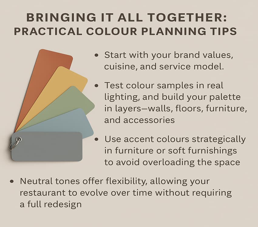
Bringing It All Together
Consistency and balance are key when designing with colour. Start with your brand values, cuisine, and service model. Test colour samples in real lighting, and build your palette in layers, walls, floors, furniture, and accessories.
Use accent colours strategically in furniture or soft furnishings to avoid overloading the space. And remember that neutral tones offer flexibility, allowing your restaurant to evolve without requiring a complete redesign.
Designing with Purpose
Colour in restaurant design is never just decorative—it’s functional, emotional, and strategic. From attracting your ideal customer to influencing how they interact with your space, colour choices matter.
At BE Furniture Sales, we provide durable, design-led furniture that complements your interior goals. Whether you’re designing a vibrant bistro, our collections offer the perfect balance of colour, style, and commercial quality.
Explore our full range today to find cafe furniture that brings your colour concept to life, and helps your space stand out.
Related Articles:
- 5 Simple Rules for Choosing Cafe and Bistro Furniture
- Opening a Cafe or Coffee Shop
- Mistakes to Avoid When Buying Restaurant Furniture
- Maintenance Tips for Restaurant & Cafe Furniture
- Time to Rethink Your Restaurant Furniture
Prefer an AI Summary?